Providing Digital Agri-Solutions to Rural and Semi-Urban Farmers
GROWTECH
UX Design
Competitive Analysis
User Research
Visual Design
Usability Testing
Design System

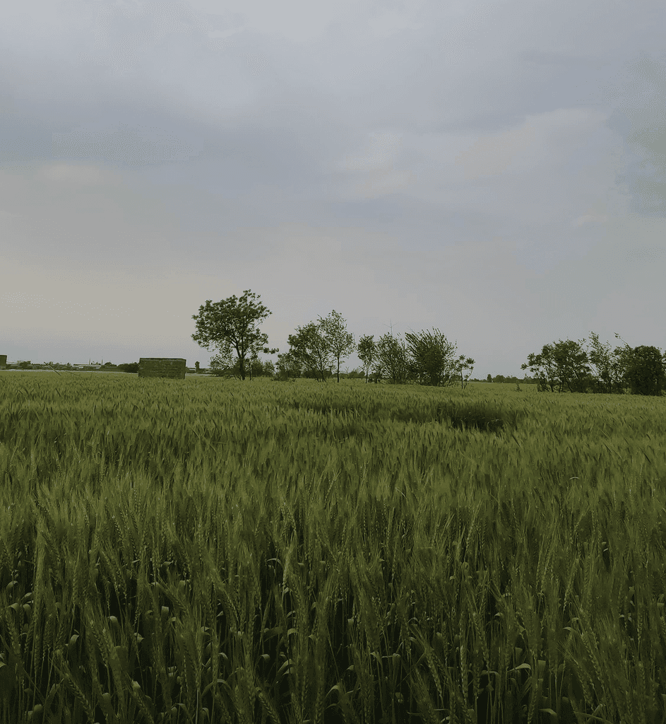
In Pakistan, farmers rely heavily on the knowledge passed down from their forefathers and the surrounding farming community to run their farms. This deep trust in traditional methods makes them reluctant to experiment with new techniques. As a result, the internet isn't a big part of their farming process. On top of this, many farmers have low literacy levels. While some can read and write in Urdu, many struggle with English.
10,000 free users
4000 paid users
All these factors were challenges for Growtech when they approached Ideate Innovation. Growtech wanted to increase their conversion rate from free to paid users. At the time, they had about 10,000 users on their platform, with 4,000 of them being paid users.
The goal of this project was to increase the conversion rate from free to paid users. This entailed a complete UX and UI overhaul.
I worked as the UX lead on this project, working directly with stakeholders to understand client needs and translating them to design tasks.

I collaborated with another designer, a researcher, and my manager to try and reach project goals.
We knew that simply overhauling the UI wouldn’t be enough. We needed to address core issues. To do this, we had to understand:
How an agritech business like Growtech operates and generates revenue.
The current user experience with the app.
These insights would guide our next steps:
To understand the business side, a fellow researcher and I interviewed experts in the agritech sector. We learned that monetizing farm satellite analysis alone was difficult, and add-ons were usually needed to convince users to pay for the application.
Next, I conducted an in-depth UX audit of the current application, using usability heuristics and UX best practices. I found several key issues:
Hierarchy Problems: Users struggled to navigate and access the app’s most important features.
Language Barriers: The dual-language support was poorly implemented, with formal Urdu that was hard for farmers to understand.
Complex User Experience: The user flow for creating and managing farms was too complicated for low-tech-literate users.
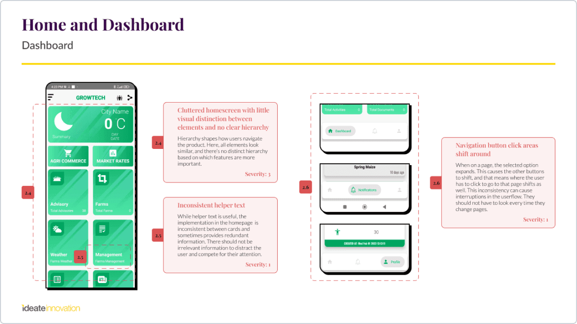
UX Audit of the old app
UX Audit of the old app
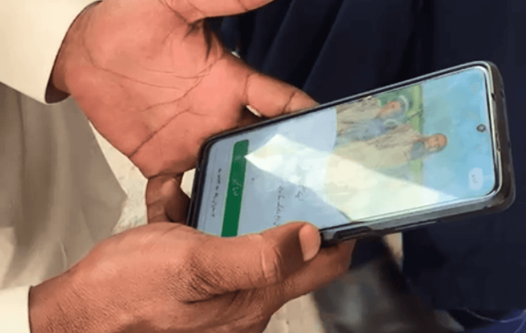
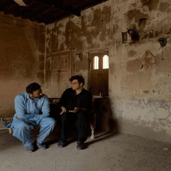
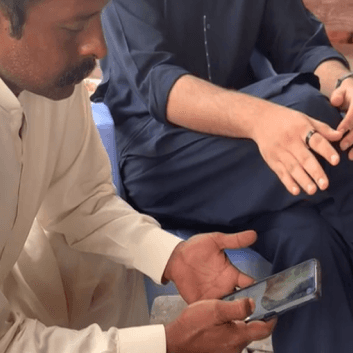
To move forward, we needed to talk to actual users. These interviews aimed to understand a typical day for farmers, how they got information, their trust levels, relationship with mobile usage, and their experience with Growtech.
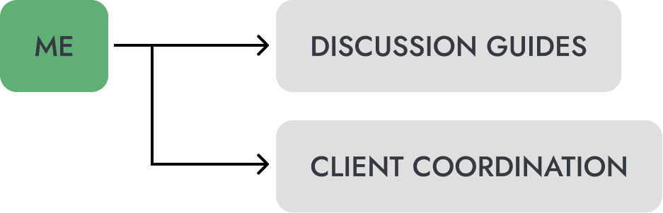
I created discussion guides and coordinated with the client to recruit interview participants. Time constraints meant we couldn't go as in-depth as we wanted, so we interviewed a broad set of users, including paid users, unpaid users, and non-customers. My colleague and I then traveled to rural areas in Punjab, Pakistan, to conduct these interviews.
In total, we conducted a total of 8 interviews over 2 days.
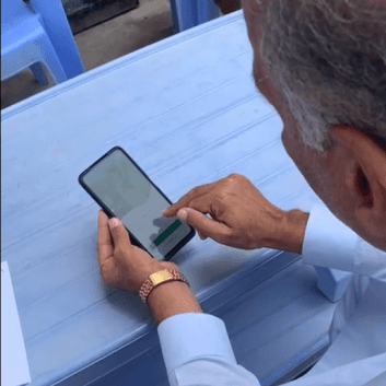
Alongside these interviews, we tested sacrificial concepts based on our findings from expert interviews and usability audits. These initial ideas helped us understand how to present value propositions and subscription services, format reports, use audio recordings for information dissemination, and streamline the farm management experience.
Looking back, I think we could have been more creative with our usability testing concepts. We played it safe and stuck to established design guidelines, potentially missing out on uncovering more innovative solutions.
From our interviews and user testing, we synthesized key themes and patterns that guided our design decisions. We identified critical insights:
Interviews
Users had low literacy and limited tech experience.
Many farmers didn’t understand English, and some struggled with Urdu.
Farmers were too busy to read reports and use the app extensively.
Trust in Growtech was low; farmers trusted their own knowledge more.
Usability Testing
Technical terminology was unclear to most users.
Users preferred Urdu, and some specific fonts were more familiar to them.
Vertical scrolling was favored as it made everything accessible at once.
Users preferred seeing all information at once rather than zooming in and out of PDFs.
Audio recordings were appreciated, especially by low-literate farmers and those busy with fieldwork.

Some wireframes prior to development
Our process narrowed down the key problems to a few critical areas. We asked ourselves how we might:
Highlight Growtech’s paid services effectively.
Encourage users to track farm data points by showing their value.
Ensure more users read and understand reports.
Improve the onboarding process to engage farmers right from the start.
Working with another designer, I developed final designs that addressed these issues. We focused on making the language and terminology accessible, adjusting the value proposition around the farmers' trust circles, and integrating the app into their daily routines.
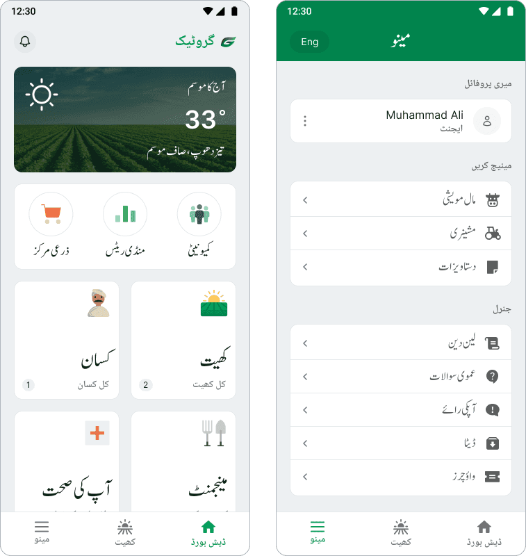
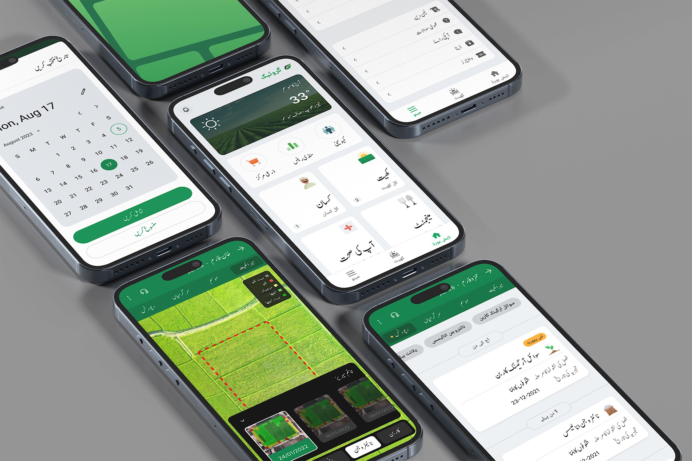
Home
We revamped the home screen with simpler illustrations and iconography. The bottom navigation was redesigned to keep farms front and center.
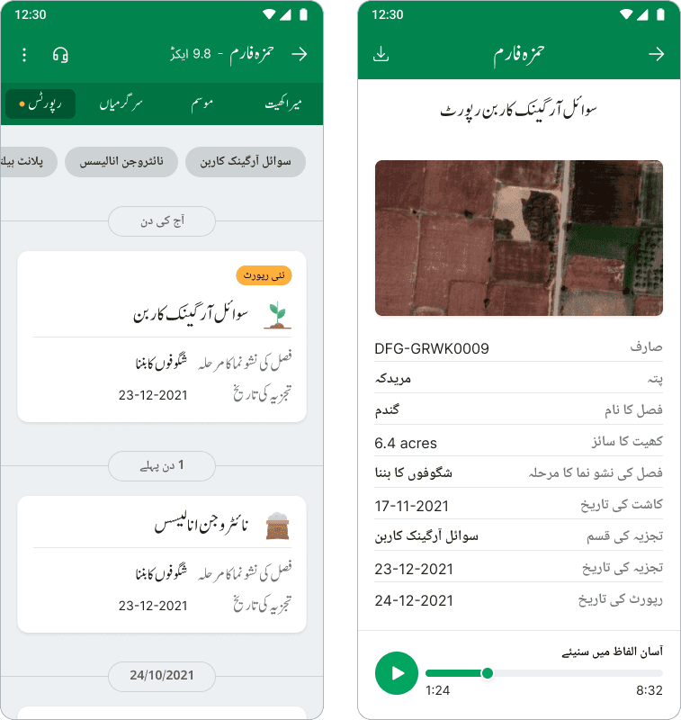
Reports
We made reports easier to navigate, differentiate, and understand. This included audio recordings to help farmers listen to reports while working.
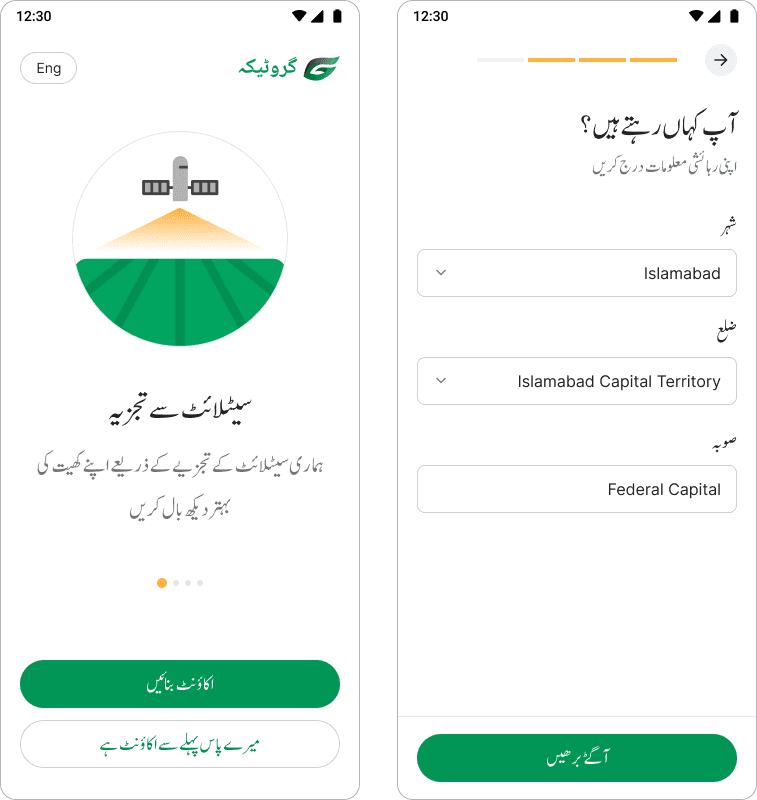
Onboarding and Registration
We streamlined the onboarding process, adding an incentive to create a farm immediately after registration, aimed at increasing farm creation rates.
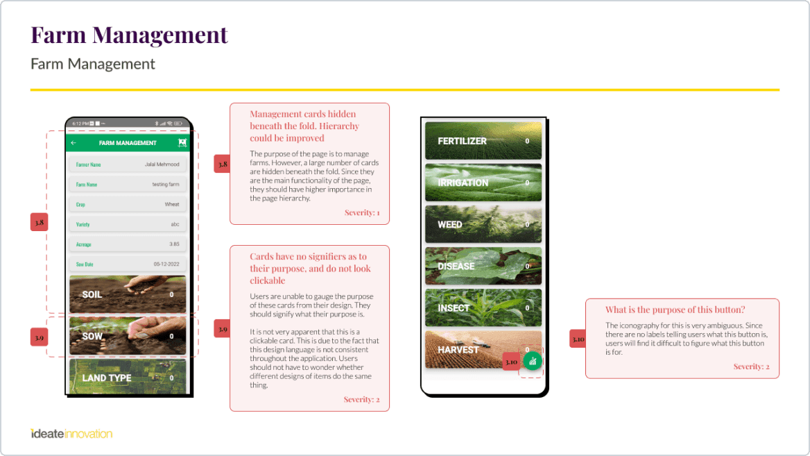
Farm Management
We restructured the information architecture of the farms page, connecting all farm-related information to the main farm and improving hierarchy and accessibility for low-tech-literate users.
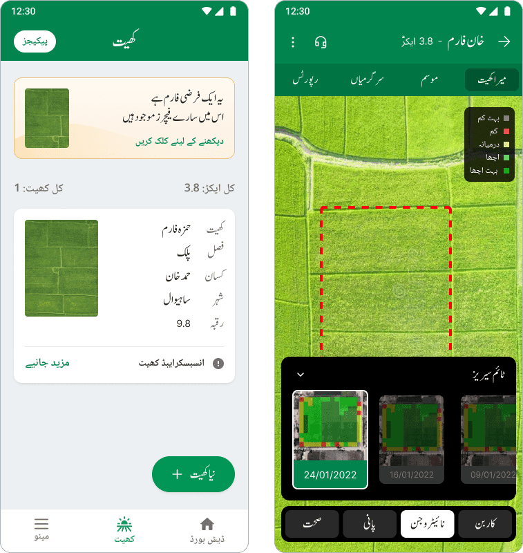
Selected Screens


This project was my first deep dive into agritech. I learned about the inner workings of agritech applications, business needs, and user requirements. Designing for low-literate populations and the importance of direct user engagement were key takeaways. Leading this project helped me hone my skills in project management, logistics, and design decision-making. Working with different team members throughout the entire project lifecycle allowed me to learn how to make sure teammates helping on final designs keep research insights in mind.
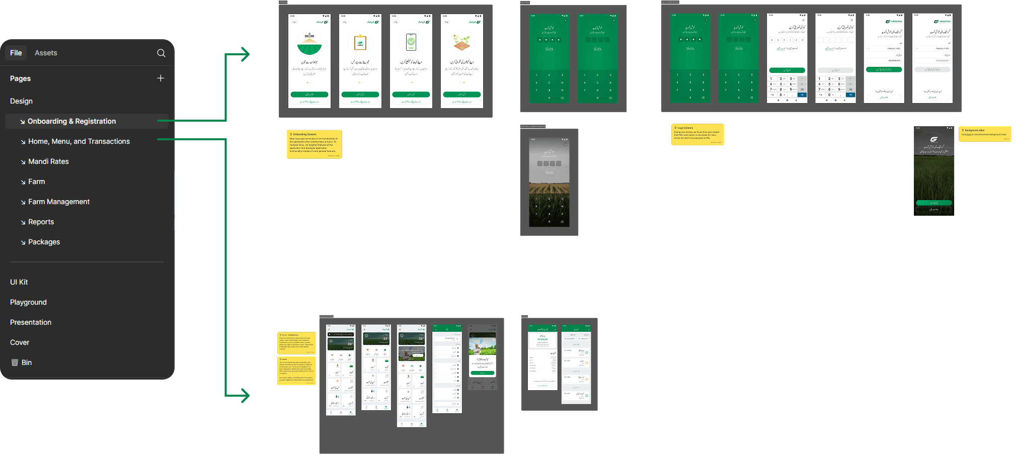
Samples from the hand-off file
In the end, our redesign made the app more accessible to its target users, with an Urdu-first approach and a focus on audio experiences. This improved the user interface and user experience, integrating the app seamlessly into the farmers’ daily lives. This resulted in a significant increase in users willing to pay for the application.


