Redesigning the Digital Experience of an Established Microfinance Bank
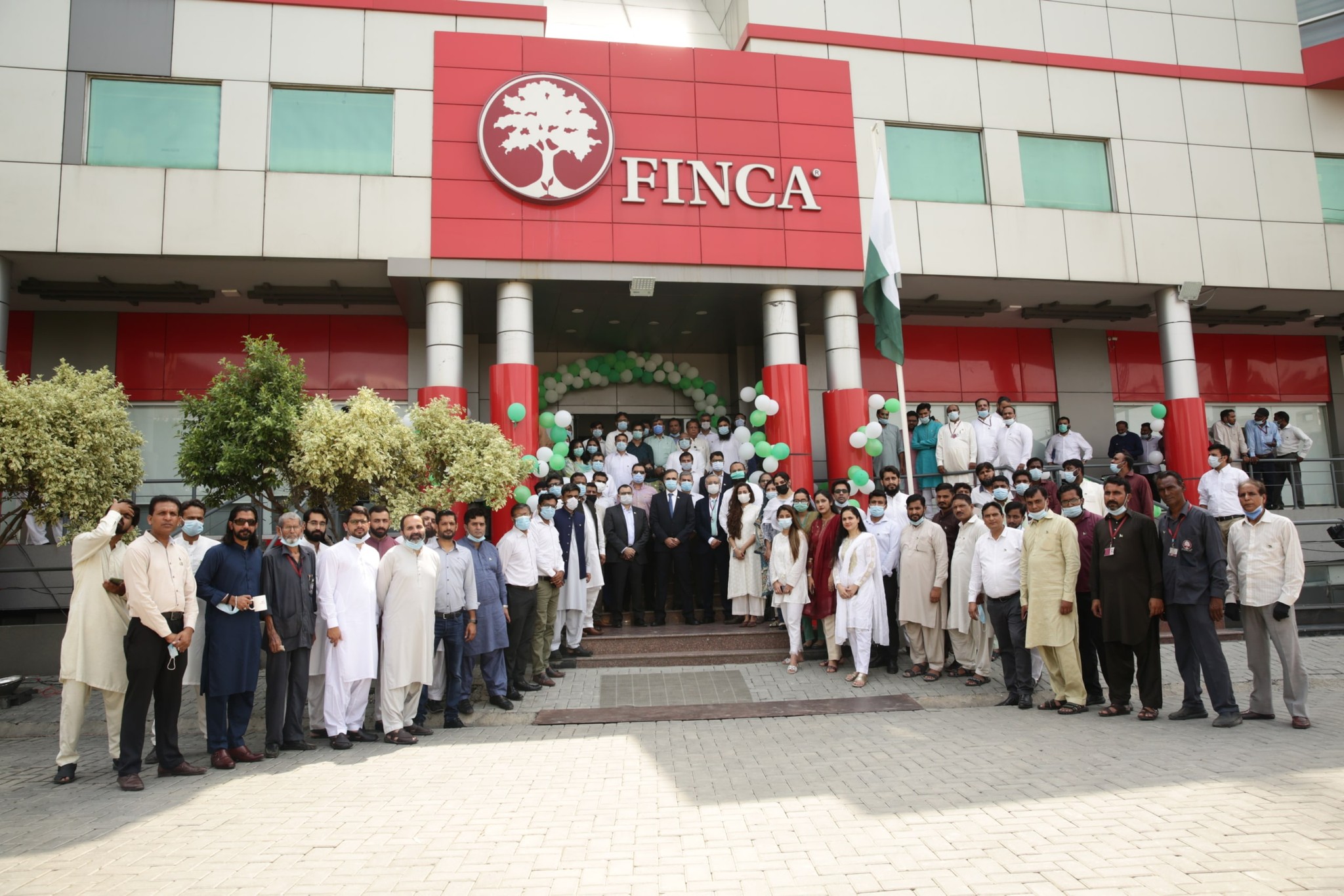
FINCA MICROFINANCE BANK
UX Design
UX Audit
User Research
Visual Design
Usability Testing
Design System
Pakistan has the third-largest unbanked population globally, but at the same time, 82% of the population has mobile internet, and over 70% have smartphones. Due to this shift towards being mobile-first, many financial institutions are trying to tap into this space.
One of these institutions is FINCA Microfinance Bank, which approached IDEATE Innovation in June 2022 to redesign their mobile app.
5% Download to Registration
8% Active after 30 days
At the time, the download to registration rate of the app was approximately 5%, with only 8% of these users active after 30 days.
Create a user-friendly yet visually appealing design targeting both low-tech customers as well as tech-savvy young users, aiming to increase both the conversion and retention rates.
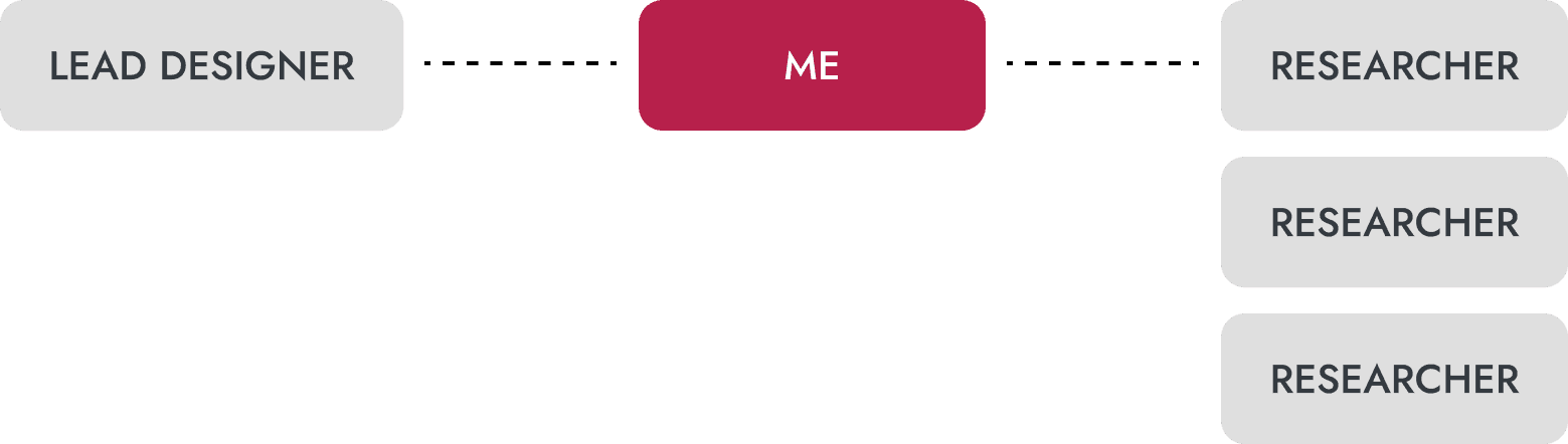
Acted as a bridge between research and UX design.
Worked with the lead designer and assisted three research team members.
Conducted field research, wrote reports, conducted user testing, and created low fidelity as well as final high fidelity designs for the application, including a design system.
We approached the project as if we were designing the product from scratch despite the bank already having an application. This allowed us to target new user segments while preventing previous decisions from driving our approach. This not only meant having a good understanding of the current user experience, but also a deep knowledge of the Digital Financial Services (DFS) landscape in Pakistan.
We engaged with internal stakeholders while simultaneously undertaking desk-research to understand the current landscape of DFS in Pakistan. Through these methods, we narrowed down our next steps:
I took the lead on conducting the UX Audit. Some of the issues I uncovered included:
Confusing hierarchy: Users were not able to find important features and information.
Long-winded payment flow: The user journey to send money to someone was confusing, and had a lack of visibility of system status.
Too much technical jargon: The application used complex language, especially considering many of the service’s users were not fluent in English, let alone banking terminology.
Now that we had an idea of issues that could be causing lack of retention among users, my fellow designer and I were able to spend some time creating low-fidelity mockups that we could test out in the field. We specifically focused on core user flows, such as sending and receiving money. We also tested visual hierarchy, onboarding experience, as well as our target userbase’s ability to understand language and financial terminology.
Homepage A/B Testing
Send Money Flow A/B Testing
To gather insights about how to target new user segments and their needs, behaviors, and pain points, my colleagues and I conducted qualitative interviews. Our main goal was to better understand users’ tech literacy, their relationship with money, their saving and investment practices, and their prior experience with fintech. This would help focus our efforts in identifying core functionality, as well as help us create personas for the various user segments.
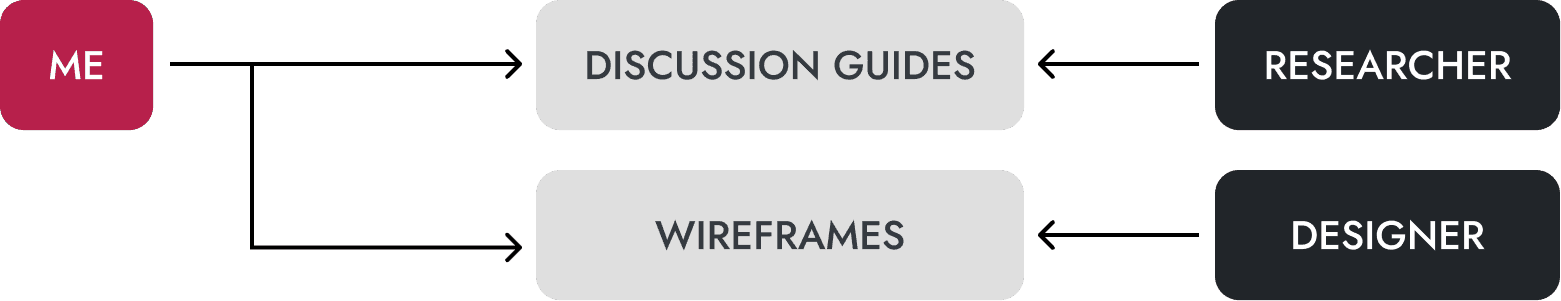
I worked alongside a dedicated researcher to create discussion guides for the interviews, and additionally incorporated UX focused interview questions. We conducted these interviews in three different cities in Punjab, Pakistan; and targeted a variety of demographics including both male and female SMEs, students, young professionals, farmers, payroll customers, etc.
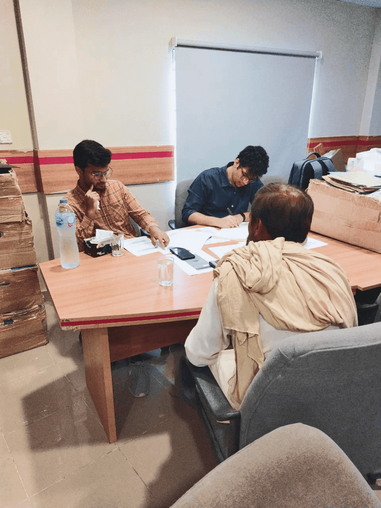

In total, we conducted 26 individual interviews, as well as 3 focus groups, over 2 weeks.
This round of interviews provided valuable insight into issues faced by customers. We also identified that many problems FINCA was facing were service based. In hindsight, I feel like some interviews were redundant due to overlap, and reducing this number would garner a similar quality of insights. Overscoping in this stage led to the project delays, which affected our morale.
Through our qualitative interviews and user testing, we were able to develop several key insights. Some of these included:
Interviews
Many users generally distrusted FINCA, pointing out flaws in the service.
The loan customers often reported that very low maximum loan amounts were a problem, as well as short periods for loan repayments.
Technical problems, such as missing OTPs, late SMS notifications, and failures within the app while performing transactions, were also very common.
Field tests showed that users struggled the most with the registration exercise, specifically biometric verification and signature capture.
Almost all customers interviewed who had taken loans were not even aware of the FINCA app or the provision for making installments of the loan through the app.
Usability Testing
Placing all options on a single screen made the processing of transactions easier by reducing steps.
Frequently used features, such as "Send Money" and "Add Money," needed to be higher in the visual hierarchy compared to ones used less often.
Transaction history needs to be easily accessible yet private since many of our users were wary of other people being able to see their balance.
Onboarding screens needed to be more engaging and attractive to grab the attention of the user more effectively.
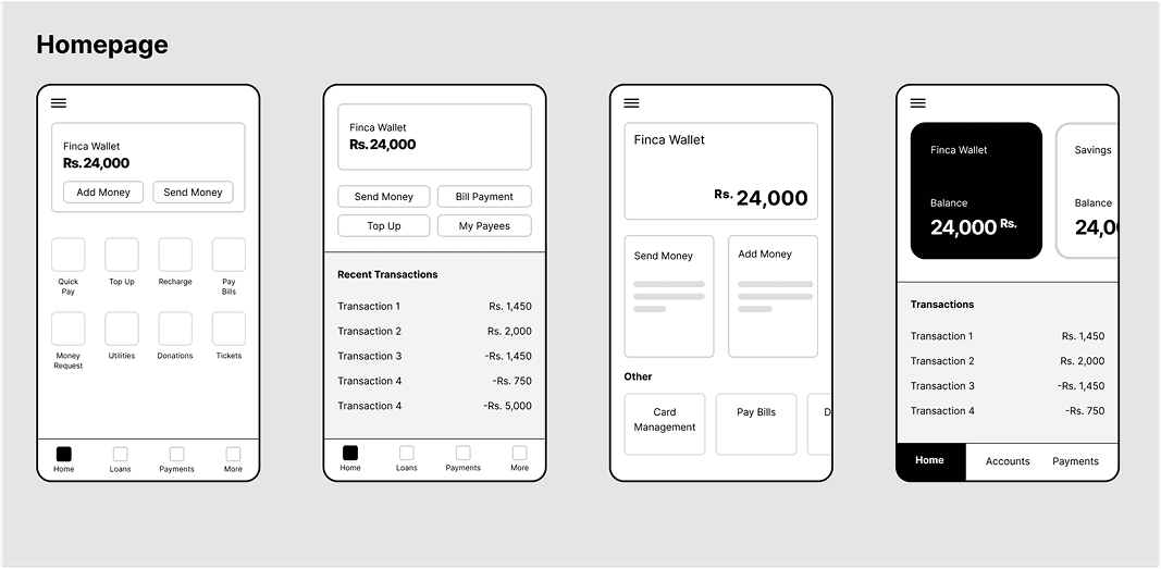
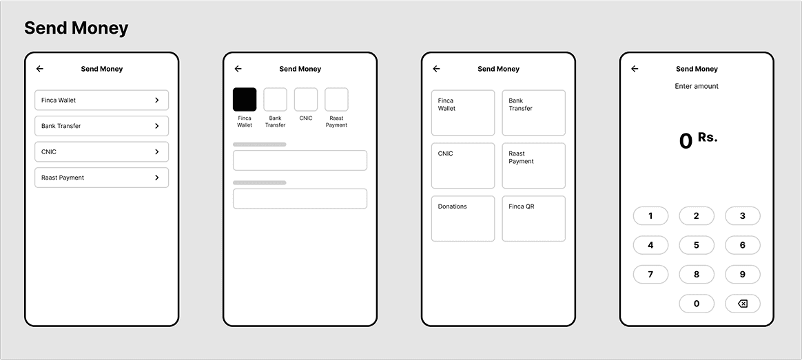
Wireframes prior to development
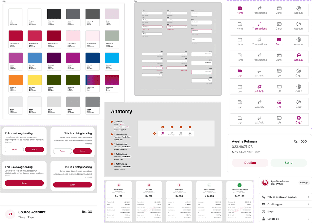
Snapshots from the design system
We now had to translate our research insights into actionable steps for the final application. To make this process simpler, we translated our insights into How Might We’s:
HMW make sure customers feel secure and comfortable when sharing information on the app?
HMW ensure users are easily able to find all important application features?
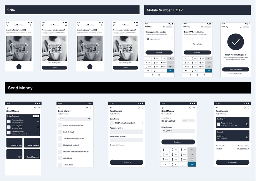
HMW make creating a FINCA account easy?
HMW implement a quick, intuitive, and informational onboarding experience?
HMW ensure users can complete transactions quickly and easily?
I then worked with the lead designer of the project to develop final designs based on these HMWs. We first collaborated on the design system, and then tackled different parts of the application based on the insights gathered.
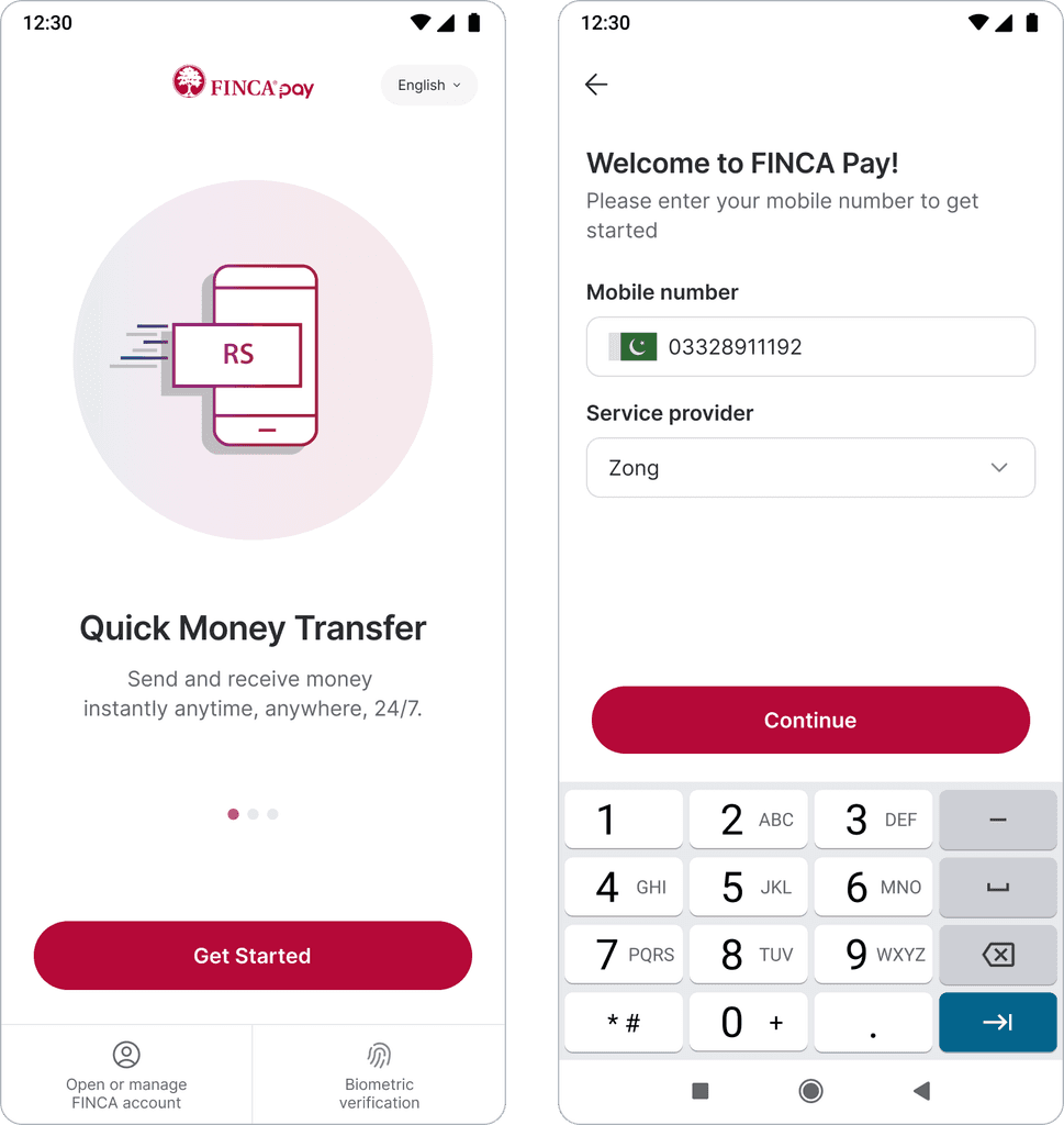
Onboarding
Research pointed to onboarding screens needing to be more interesting and visually appealing to engage users effectively, as well as making sure the process to get into the application was short.
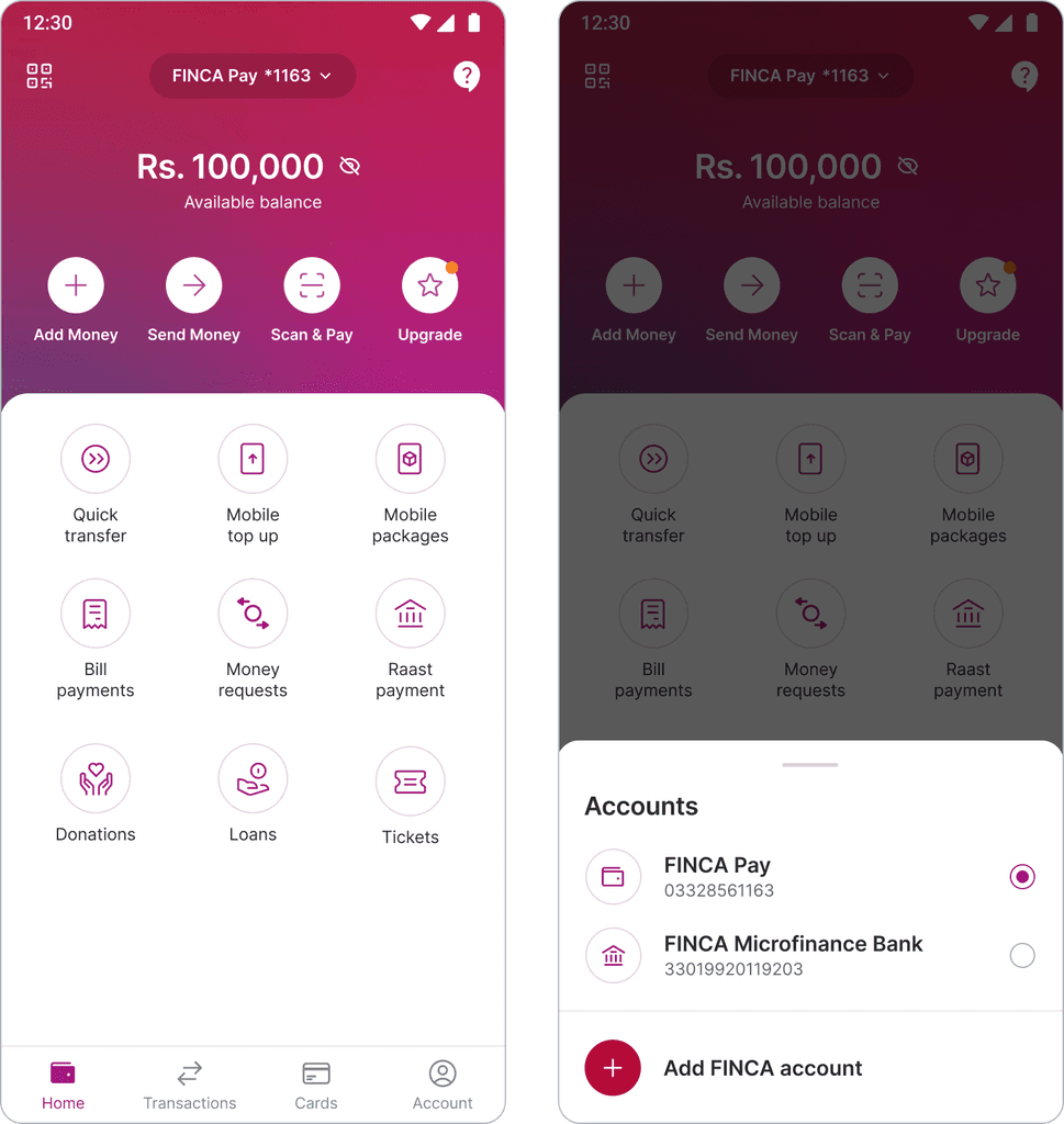
Home and Navigation
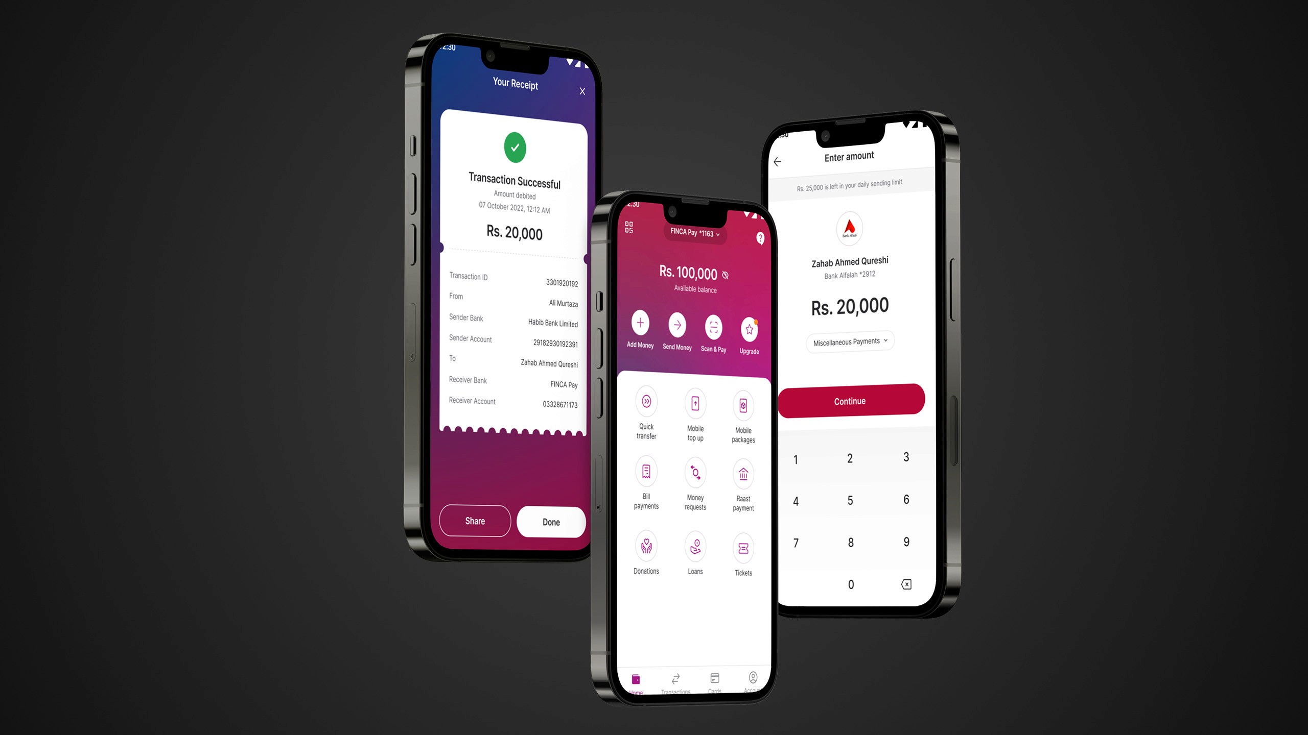
Users preferred fewer clicks when searching for a feature, so we adjusted the home screen to have visibility of all actions, and increased prominence of frequently used items. We also introduced a navigation bar for easy access to other parts of the app.

Transaction Flow
Insights during testing revealed that users preferred entering the amount at the end of the money sending flow. We also used this journey as a blueprint throughout the app, minimizing users’ memory load and ensuring consistency.
Account and Transaction Management
We streamlined the verification process, kept users informed about the status, and increased clarity about transaction limits and upgrade pathways.


Design and Usability
To make the app more accessible for a broader user base, we introduced the ability to switch between English and Urdu. We also improved information architecture, maintained a visual hierarchy, fixed clear terminology, and added descriptive error states.
Overall, our redesign made the FINCA app more accessible and appealing to its target users, integrating seamlessly into their daily lives and improving overall user satisfaction. This resulted in a 30% increase in customer retention.
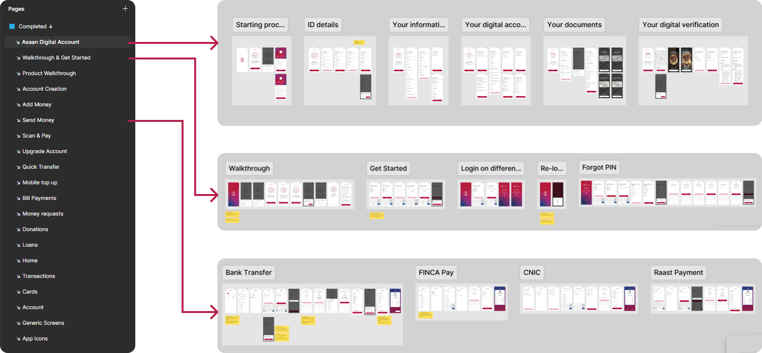
Samples from the hand-off file
This project was an invaluable learning experience for me, especially when designing for a diverse user base with varying levels of technical literacy. I learned to manage my place in large, multi-month projects with multiple stakeholders. Being part of both the research and design teams allowed me to take part in the entire process from conception to handoff.


